The Simple Joy Of Design
A project by collaborator Shachar Aylon, featured on Open Late as part of an ongoing creative relationship.
THE CHALLENGE
Picsart had 150 million people creating things every month: memes, album covers, portraits, collages. The product worked. The brand looked like it belonged to a different company.
The old wordmark sat uncomfortably close to Comic Sans, a real problem for a design company. Marketing looked one way, product another. The tone read generic tech when it should have felt like a creative movement.
The harder problem: most design software implies a prerequisite, whether it's Adobe's professionals or Canva's businesses. Picsart's whole point was that anyone could make something, right now. The brand didn't say that yet.
Most users lived outside North America, while the visual approach still defaulted to Western tech. We needed something genuinely global, not just translated.
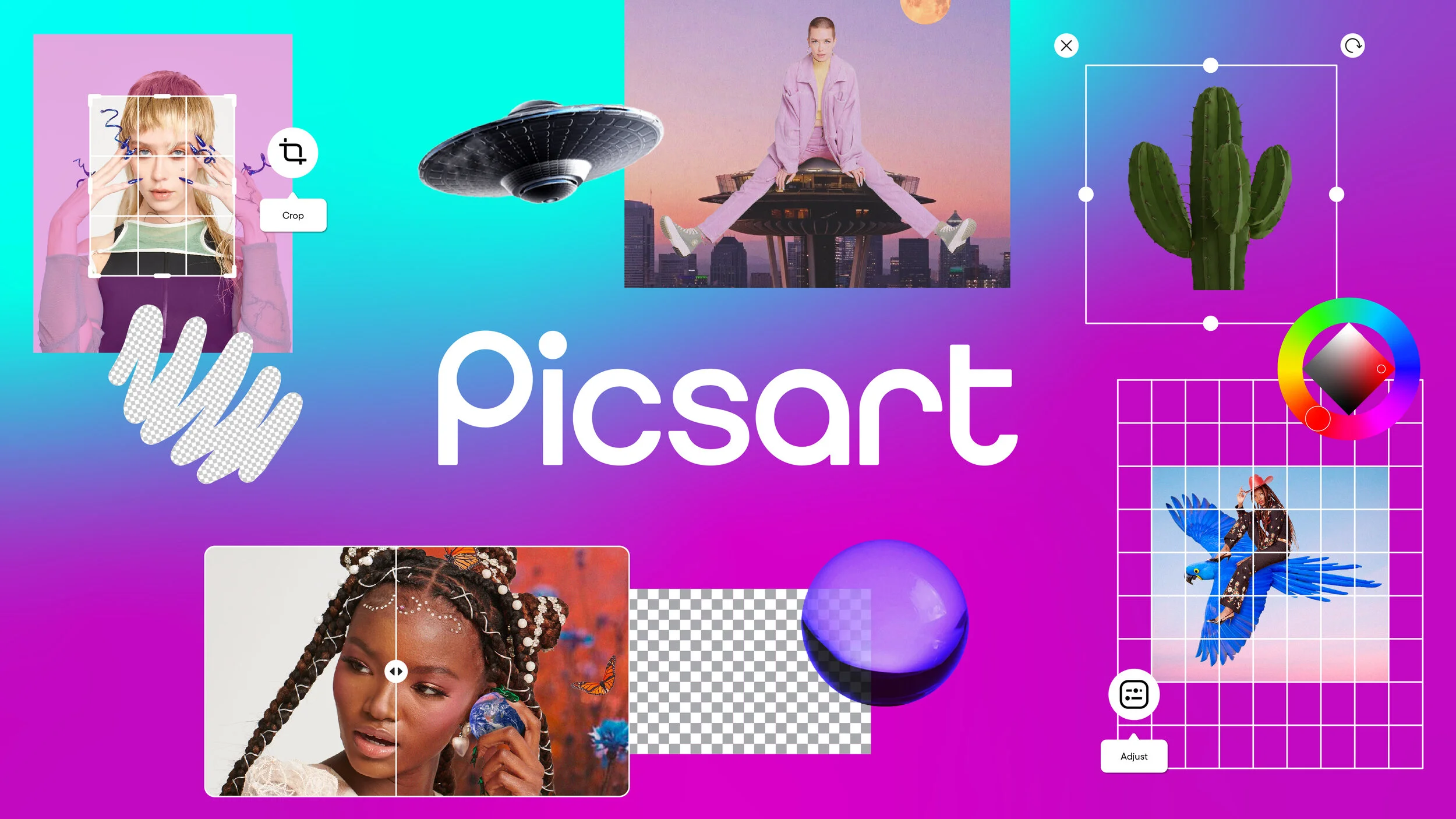


THE WORK
The starting point wasn't a blank canvas. Picsart users never start with one either. They start with a photo and push it somewhere unexpected. We built the brand system the same way.
The wordmark. Geometric, modern, a step forward rather than a break. PicsArt became Picsart, a small change that said a lot.
The photography. Built with Jacq Harriet, a library the team could use as raw material, the same way the community does: gyaru fashion, ikebana, DJ culture, real creative worlds instead of stock diversity.
The frame system. Borrowed from art galleries, where a single device holds different artists together. Shachar built a gradient frame pulled from each creation's dominant colors. Unique pieces, one coherent system.
The voice. Developed with Hermit: the rebel art teacher, a mentor and a misfit with some edge.
Product integration. Brand and product designers worked in the same room from day one, so the system felt coherent from app icon to billboard.
Global by design. Built with country managers worldwide on bespoke compositions for each market, global from the start rather than adapted after the fact.

THE RESULT
The rebrand landed. Across every surface, at once.
Key outcomes:
4x increase in awareness above industry benchmarks on OOH campaigns
34% uplift in new users embracing account functionality post-launch
Marketing and product felt unified for the first time
Localized executions outperformed one-size-fits-all approaches in every market tested
Artist partnership drops created ongoing return visits and community FOMO
Picsart moved from "photo editing app" to "global creative platform." Not because we said so. Because the brand finally looked the part.
Accessibility doesn't mean amateur. Picsart democratizes design, but 150 million people deserve a brand that looks world-class. We gave them one.


